Taste Testing
library(dplyr)
library(ggplot2)
# library(tidyr)
# library(ggthemes)
# library(gpairs)
Load in the data.
x <- read.table("data_passingQs.txt", sep="\t", header=TRUE, as.is=TRUE) # responses
y <- read.table("subGenderAge.txt", sep="\t", header=TRUE) # gender, age
x$imgNo <- as.integer(substr(x$imgNo, 2, 4)) # removing .jpg, convert to integer
x <- x %>% group_by(subNo, imgNo) %>% mutate(count = n()) %>% ungroup()
good.img <- c(85, 65, 81, 25, 7, 78, 59, 21, 58, 76, 60, 95, 1, 82, 64, 56, 97, 5, 73, 36, 75, 38, 8, 29, 26, 80, 79, 32, 35, 93, 69, 42, 99, 31, 72, 24, 3, 94, 23, 48, 68, 66, 50, 46, 34, 89, 30, 96, 39, 10)
bad.img <- c(27, 28, 37, 9, 70, 43, 17, 44, 88, 19, 90, 92, 71, 77, 2, 100, 22, 98, 45, 40, 87, 49, 16, 57, 20, 11, 55, 62, 54, 91, 12, 63, 41, 52, 15, 18, 13, 84, 86, 67, 61, 74, 53, 4, 51, 6, 33, 83, 14, 47)
imgs <- c(good.img, bad.img)
img.rank <- order(imgs)
x$imgRank <- img.rank[x$imgNo]
x$imgGood <- x$imgRank <= 50Data Cleaning
Repeated Observations
50 images are shown twice, to make sure that they’re actually paying attention to the images. Let us look at the absolute difference in ratings between the same two images, and then average the differences.
repeats <- x %>%
  filter(count == 2) %>%
  group_by(subNo, imgNo) %>%
  summarise(
    pair.diff = max(response) - min(response)
  ) %>%
  summarise(
    pair.diff.mean = mean(pair.diff)
  )
hist(repeats$pair.diff.mean)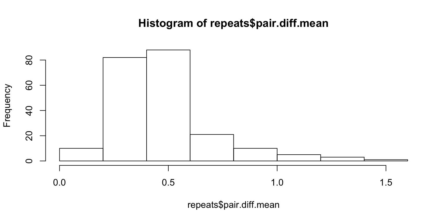
We need to come up with a measure of significance. For instance, the average will not show anything if someone simply rates everything 3. One way to solve this problem is to scramble the pairings of the 100 paired images and look at the distribution of the mean of the differences under arbitrary pairings.
Lazy way – sample with replacement:
set.seed(1)
Nsim <- 10^3
subj <- unique(x$subNo)
n <- length(subj)
df <- data.frame(subNo = integer(n), pvalue = numeric(n))
for (i in 1:n) {
  s <- subj[i]
  r <- x %>%
    filter(subNo == s & count == 2) %>%
    sample_frac(Nsim, replace=TRUE)
  m.resp <- matrix(r$response, ncol=Nsim, byrow=FALSE)
  sample <- colMeans(abs(diff(m.resp)[c(TRUE, FALSE),]))
  obs.mean <- repeats %>% filter(subNo == s) %>% .$pair.diff.mean

  df$subNo[i] <- s
  df$pvalue[i] <- mean(obs.mean > sample)

  # showing some graphs for particular people
  if (s %in% 56:58) {
    hist(sample,
      xlim=c(min(obs.mean, min(sample)), max(obs.mean, max(sample))),
      main=paste("Null distribution for subject", s))
    abline(v=obs.mean, col=2)
  }
}
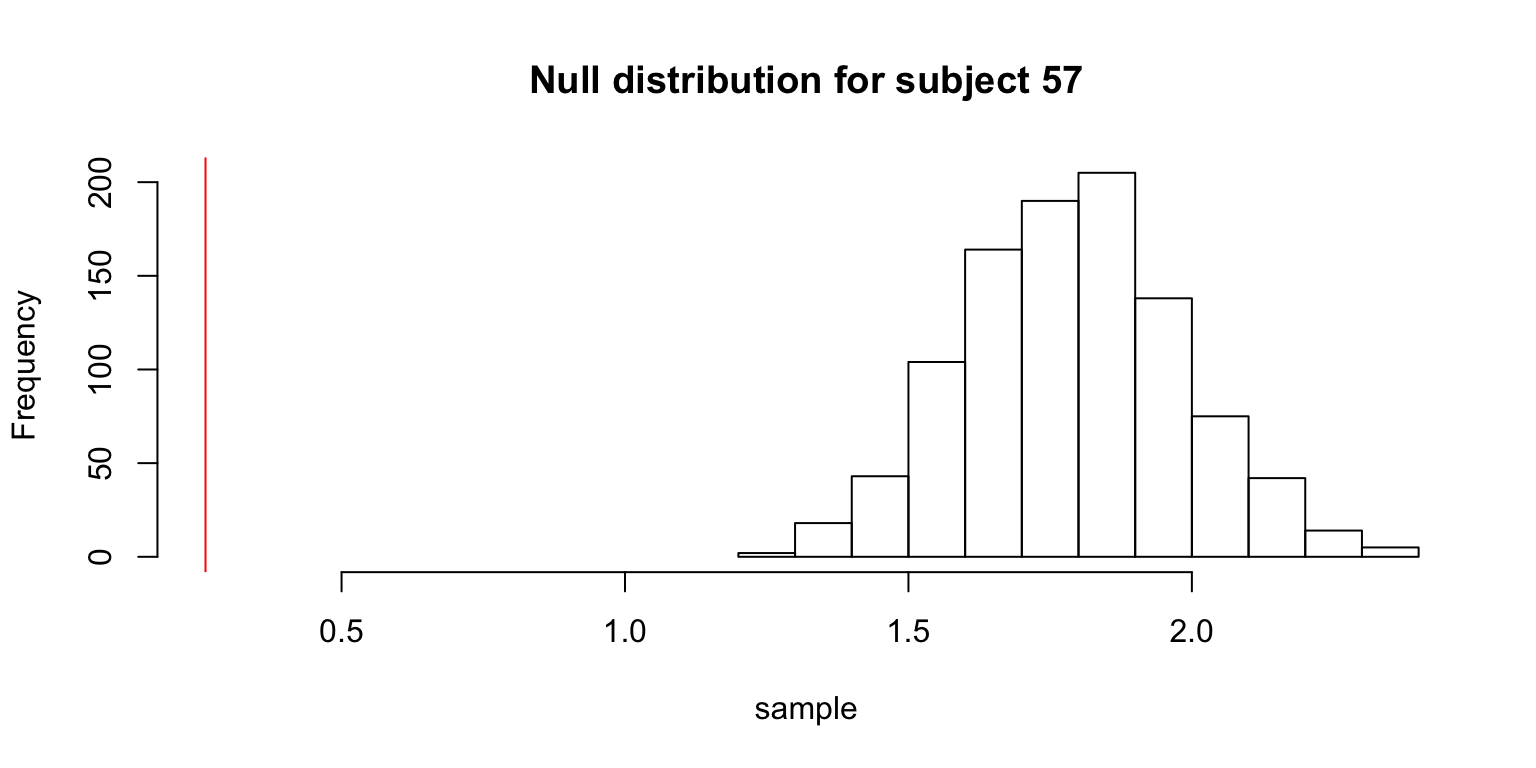
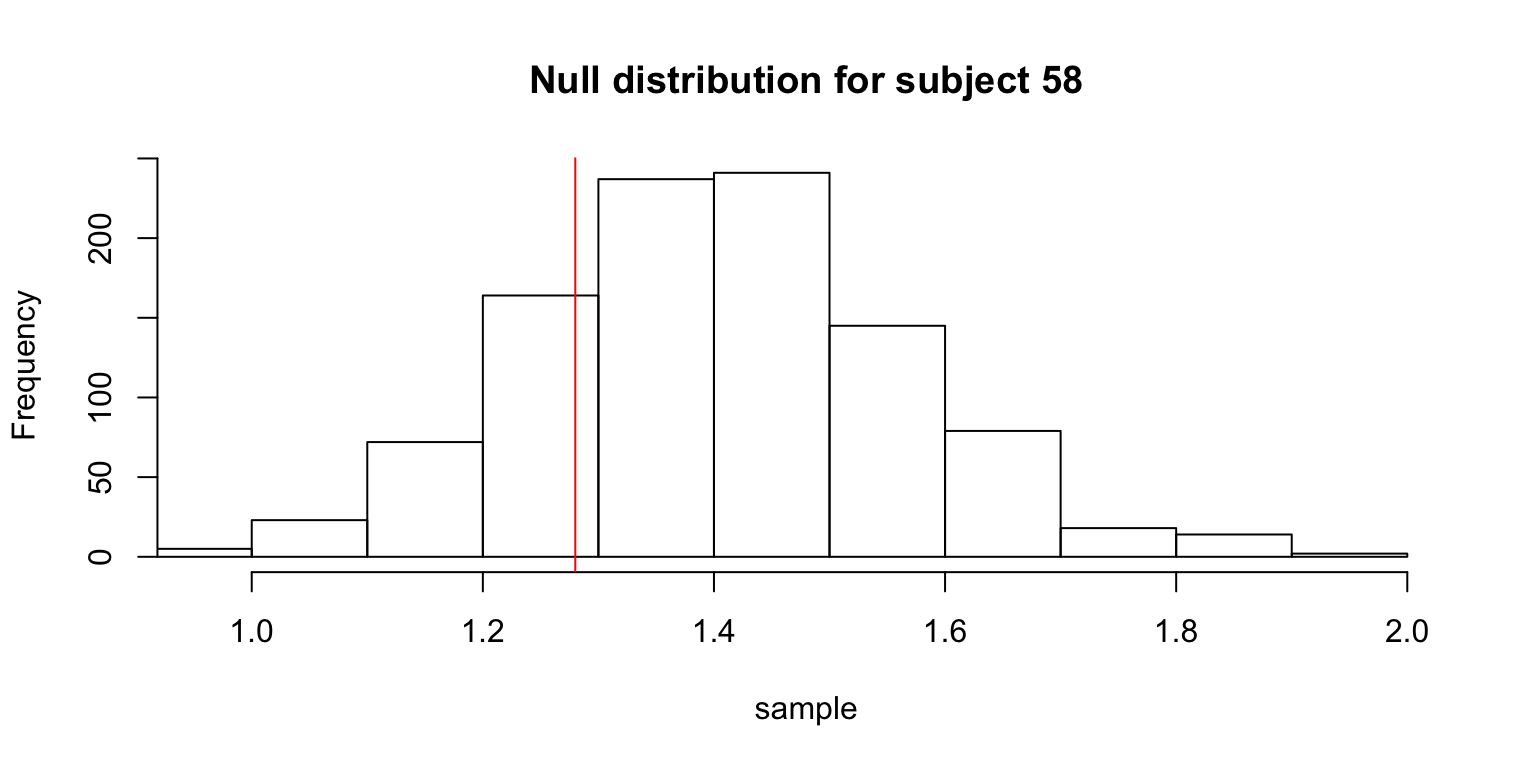
The table gives the subjects whose observed means was not significantly smaller than the means from the null distribution.
df %>% filter(pvalue > 0.05) %>% knitr::kable()| subNo | pvalue |
|---|---|
| 56 | 0.802 |
| 58 | 0.176 |
| 201 | 0.795 |
| 260 | 0.730 |
More accurate way – sample without replacement:
set.seed(1)
Nsim <- 10^3
subj <- unique(x$subNo)
n <- length(subj)
df2 <- data.frame(subNo = integer(n), pvalue = numeric(n))
for (i in 1:n) {
  s <- subj[i]
  r <- x %>%
    filter(subNo == s & count == 2)
  sample <- vector(,Nsim)
  for (j in 1:Nsim) {
    sample[j] <- mean(abs(diff(r %>% sample_frac(1) %>% .$response)[c(TRUE, FALSE)]))
  }
  obs.mean <- repeats %>% filter(subNo == s) %>% .$pair.diff.mean

  df2$subNo[i] <- s
  df2$pvalue[i] <- mean(obs.mean > sample)
}
df2 %>% filter(pvalue > 0.05) %>% knitr::kable()| subNo | pvalue |
|---|---|
| 56 | 0.772 |
| 58 | 0.106 |
| 201 | 0.814 |
| 260 | 0.710 |
bad.subjects <- df %>% filter(pvalue > 0.05) %>% .$subNo
x <- x %>% filter(!(subNo %in% bad.subjects))
So, both methods show that subject numbers 56, 58, 201, 260 should be discarded.
Anomalous Response Time
Some checking reveals an anomaly.
x %>% filter(RT < 0) %>% knitr::kable()| subNo | trialNo | imgNo | response | RT | count | imgRank | imgGood |
|---|---|---|---|---|---|---|---|
| 55 | 79 | 100 | 4 | -17542.89 | 2 | 66 | FALSE |
x <- x %>% filter(RT > 0)

x %>%
  group_by(subNo) %>%
  summarize(s.RT = sum(RT)) %>%
filter(s.RT > quantile(s.RT, .95)) %>% knitr::kable()| subNo | s.RT |
|---|---|
| 7 | 760.352 |
| 55 | 1910.140 |
| 56 | 3360.931 |
| 87 | 719.724 |
| 90 | 760.004 |
| 95 | 668.993 |
| 182 | 826.232 |
| 212 | 668.532 |
| 218 | 1040.215 |
| 301 | 715.014 |
| 312 | 1050.873 |
To be continued…
Correlations
The current method for calculating a measure of taste normality involves calculating the correlation between one person’s rating of images, and the average rating of images. From the figure below, it looks like there is a good portion of people who are close to the taste norm (many people having 0.7 and 0.8 correlation with the average).
mean.responses <- tapply(x$response, x$imgRank, mean)
response.table <- tapply(x$response, list(x$imgRank, x$subNo), mean)
corrs <- apply(response.table, 2, function(x) cor(x, mean.responses))
plot(sort(corrs, decreasing=TRUE))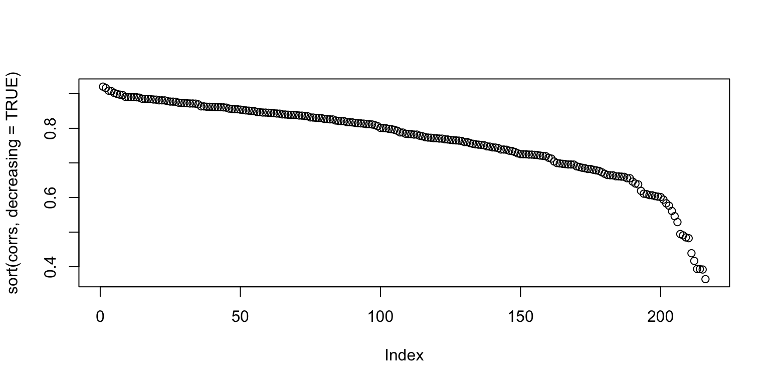
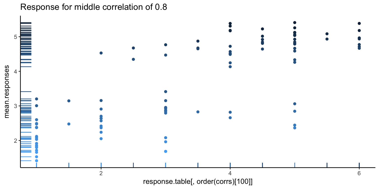
It’s always good to go deeper. Let’s look at some individual responses versus the average. Below, we show the individual with the highest correlation, lowest correlation, and median correlation (with bars on the left side showing the density of points, and the darker points corresponding to higher ranked images).
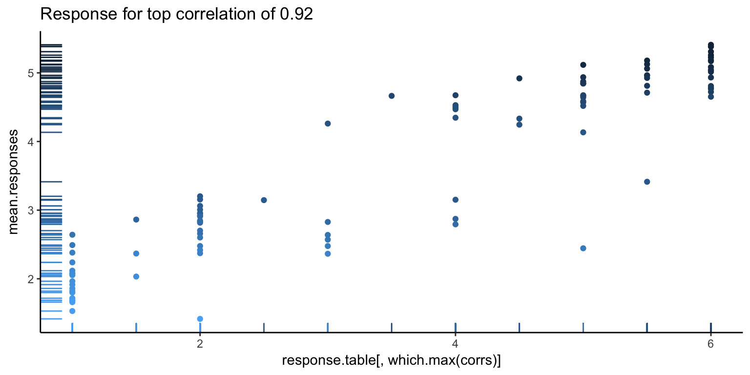
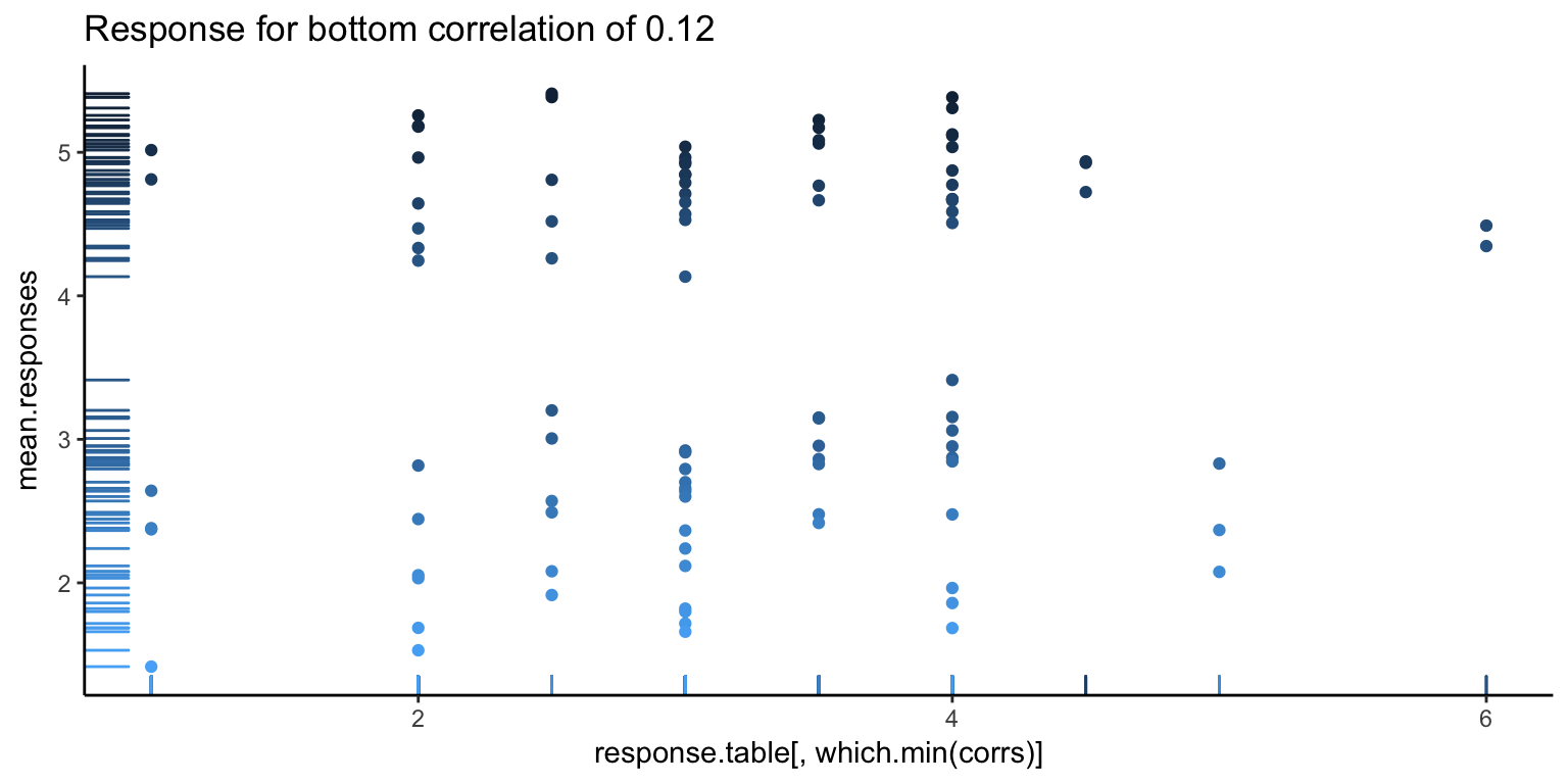
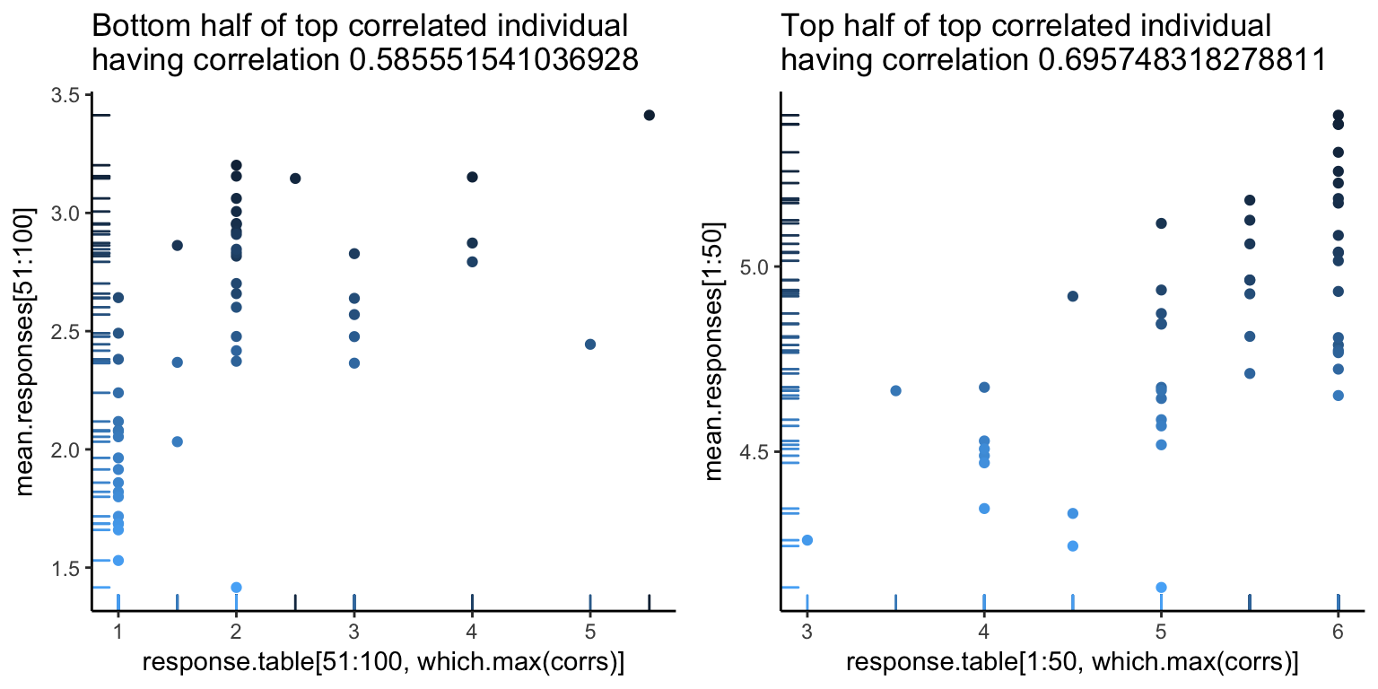
The first image looks pretty good, as you can see a pretty clear positive trend, which explains the high correlation. However, we can also see hints of problems to come. There seems to be a white band in all the above images, corresponding to a clear separation between good and bad images. Let’s go one more level deeper – below is the first image, split in half (the left showing only the first 50 images, and the right showing the rest). Note the new correlations. From the top value of 0.92, we’ve dropped down to 0.5. Not so good – so, at this point, it looks like what is driving a lot of the high correlation values is that gap.
For an alternative view, let’s look at what the responses look like. Below, the \(y\)-axis is the subject number, and the \(x\)-axis is the image rank. We see a noticable separation between the first 50 good images and the 50 bad images (a line down the center of the image below), as well as a decent match-up in terms of ranking of images (yellow is higher rating).
image(response.table)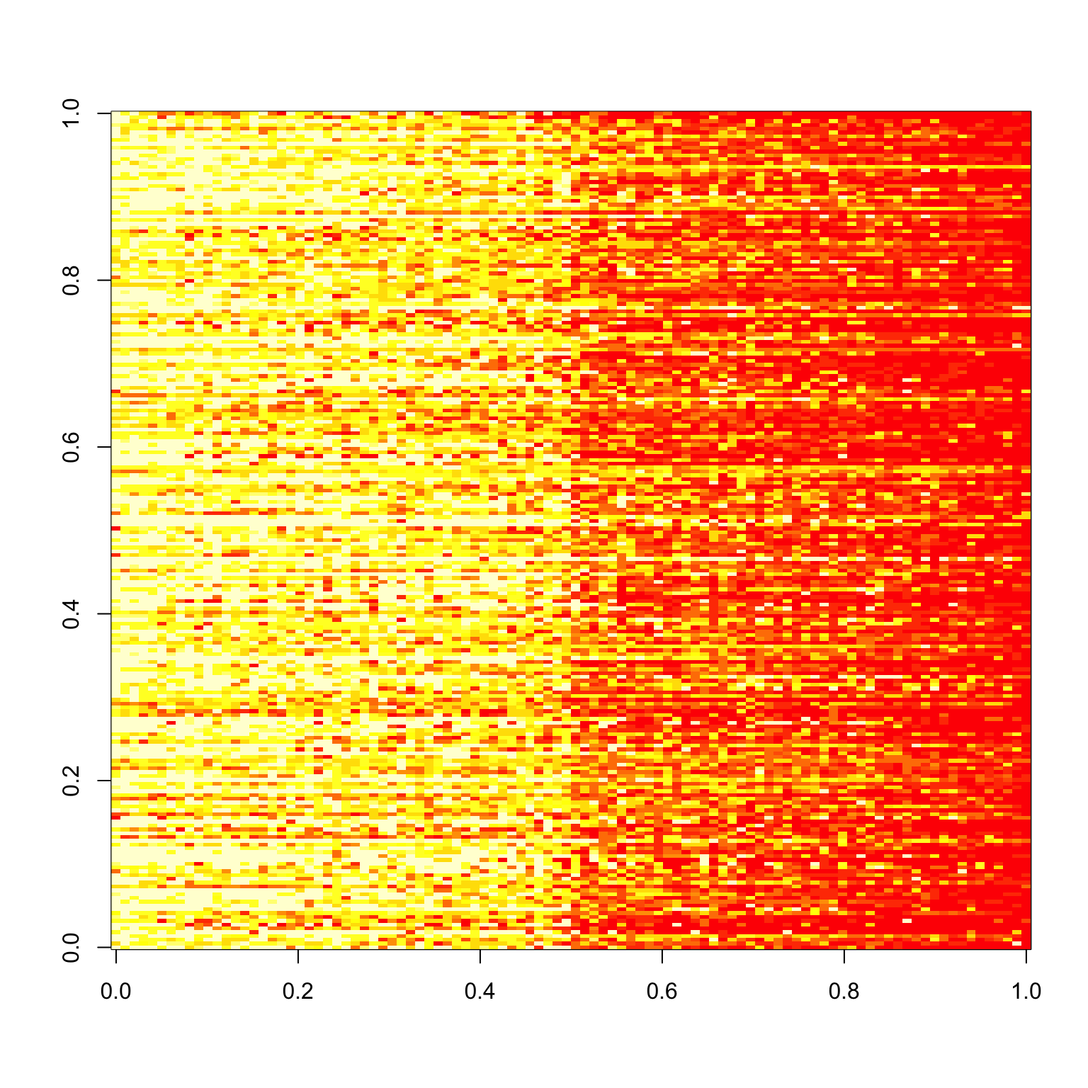
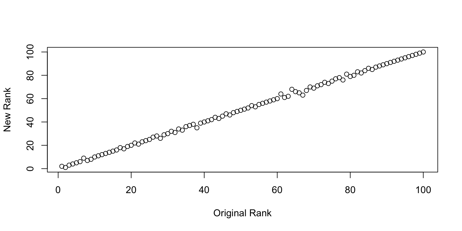
We can go one step further and check how well the rankings line up. Surprisingly well is the answer. So at least on average, there is a pretty clear consistency in the ranking of images1 I find this incredibly surprisingly to begin with, but perhaps this is what the wisdom of the crowd is all about..
Plot of New Rank vs. Old Rank.
Sanity Check
We can perform a sanity check by randomly splitting the images in two, and seeing if the resulting correlations match up.
set.seed(1)
rnd.img <- sample.int(100)
rnd.img1 <- rnd.img[1:50]
rnd.img2 <- rnd.img[51:100]

checkCorrelations <- function(x, rnd.img1, rnd.img2) {
  x1 <- x %>% filter(imgRank %in% rnd.img1)
  x2 <- x %>% filter(imgRank %in% rnd.img2)
  rnd.x <- list(x1, x2)
  rnd.corrs <- list()
  for (i in 1:2) {
    rx <- rnd.x[[i]]
    mean.responses <- tapply(rx$response, rx$imgRank, mean)
    response.table <- tapply(rx$response, list(rx$imgRank, rx$subNo), mean)
    corrs <- apply(response.table, 2, function(x) cor(x, mean.responses))
    rnd.corrs[[i]] <- corrs
  }
  plot(rnd.corrs[[1]], rnd.corrs[[2]])
  abline(0,1)
}
checkCorrelations(x, rnd.img1, rnd.img2)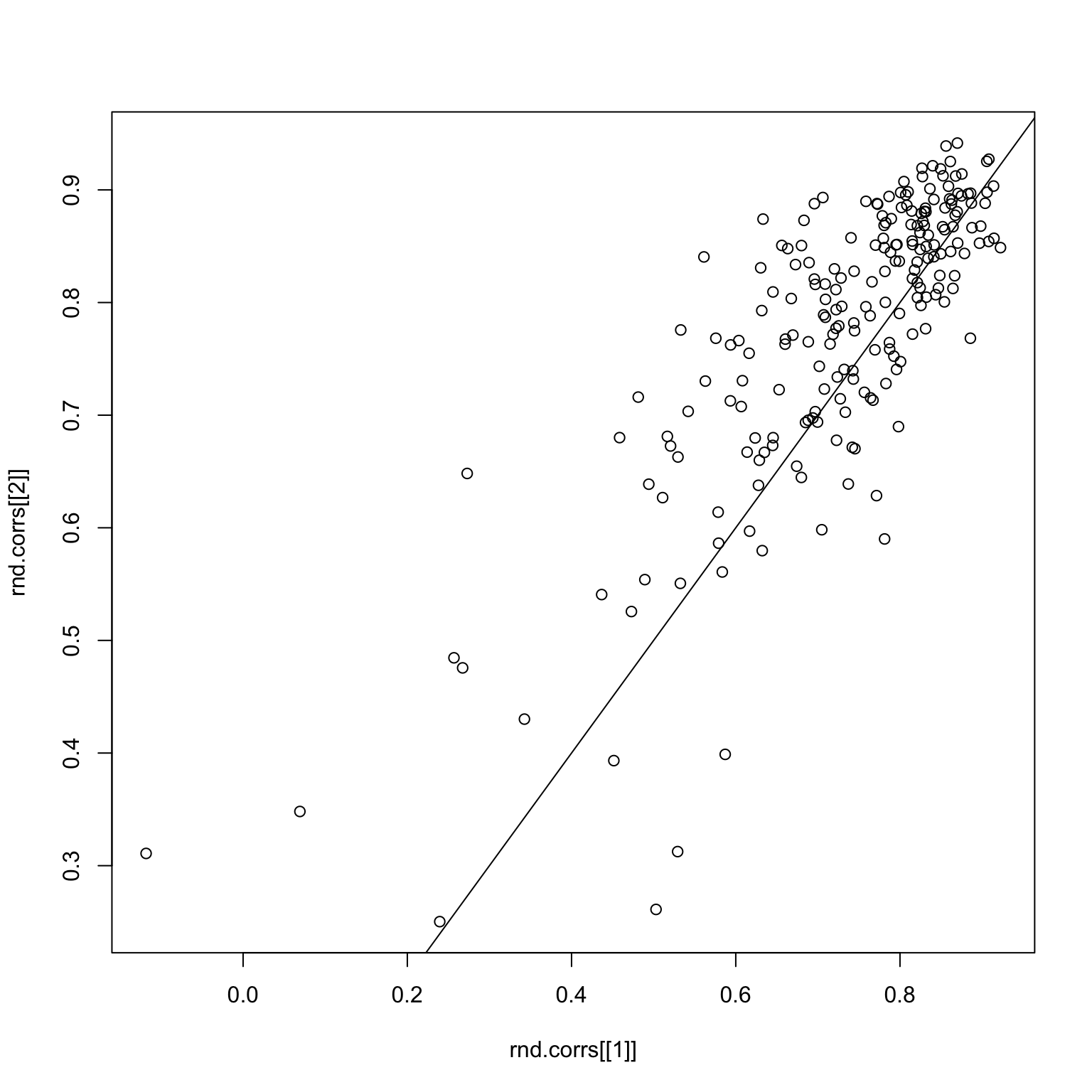
Things look pretty good here. But what if we subset to good images only? The first image is the image response matrix restricted to the first 50 good images, and the second image is the paired correlations.
set.seed(1)
good.x <- x %>% filter(imgGood)
image(tapply(good.x$response, list(good.x$imgRank, good.x$subNo), mean))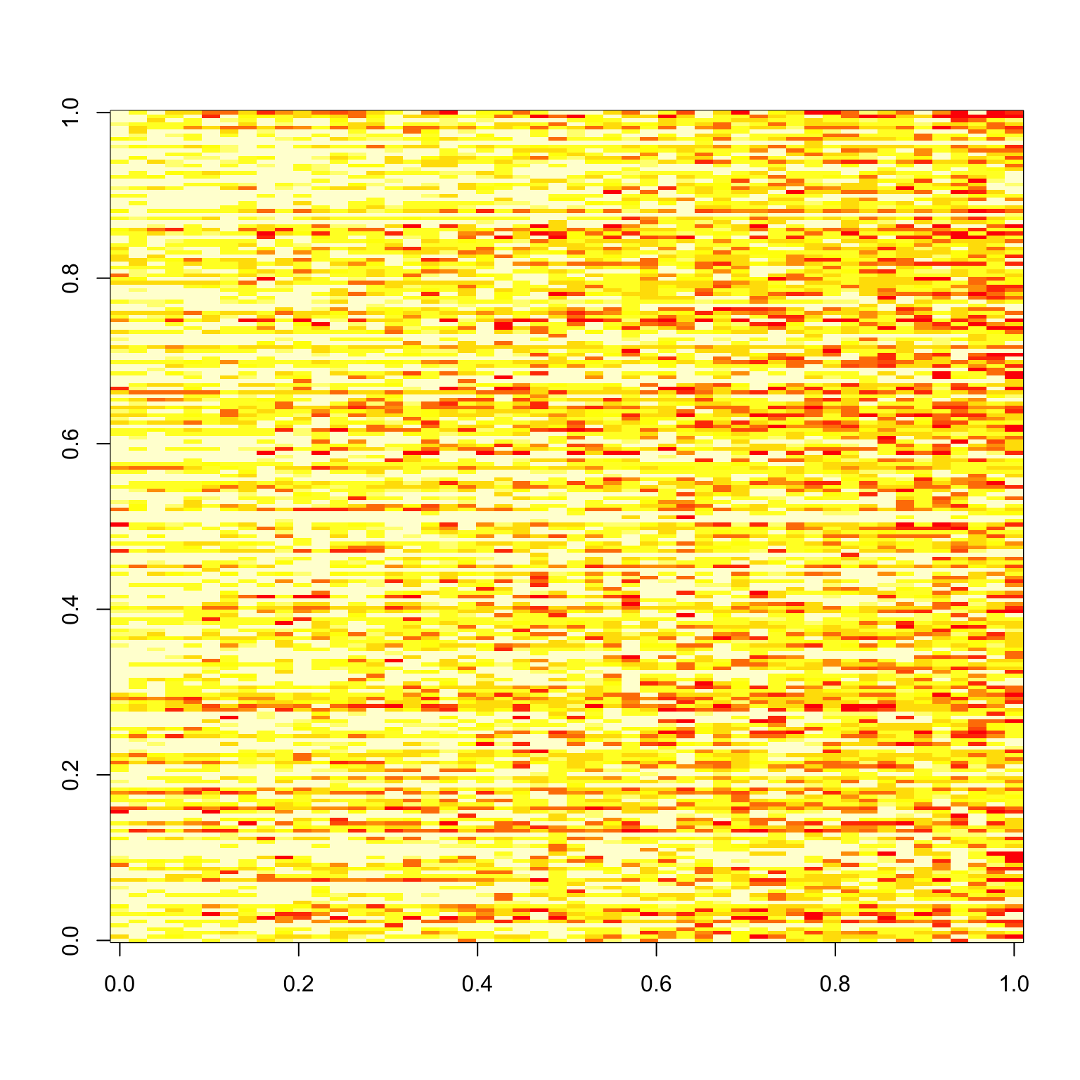
rnd.img <- sample.int(50)
rnd.img1 <- rnd.img[1:25]
rnd.img2 <- rnd.img[26:50]

checkCorrelations(good.x, rnd.img1, rnd.img2)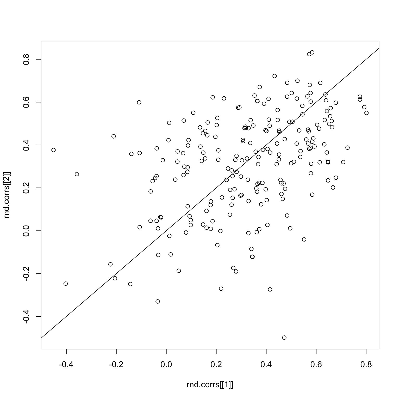
Clearly, the correlations are now all over the place. The same thing holds for the bad images.
set.seed(2)
bad.x <- x %>% filter(!imgGood)
image(tapply(bad.x$response, list(bad.x$imgRank, bad.x$subNo), mean))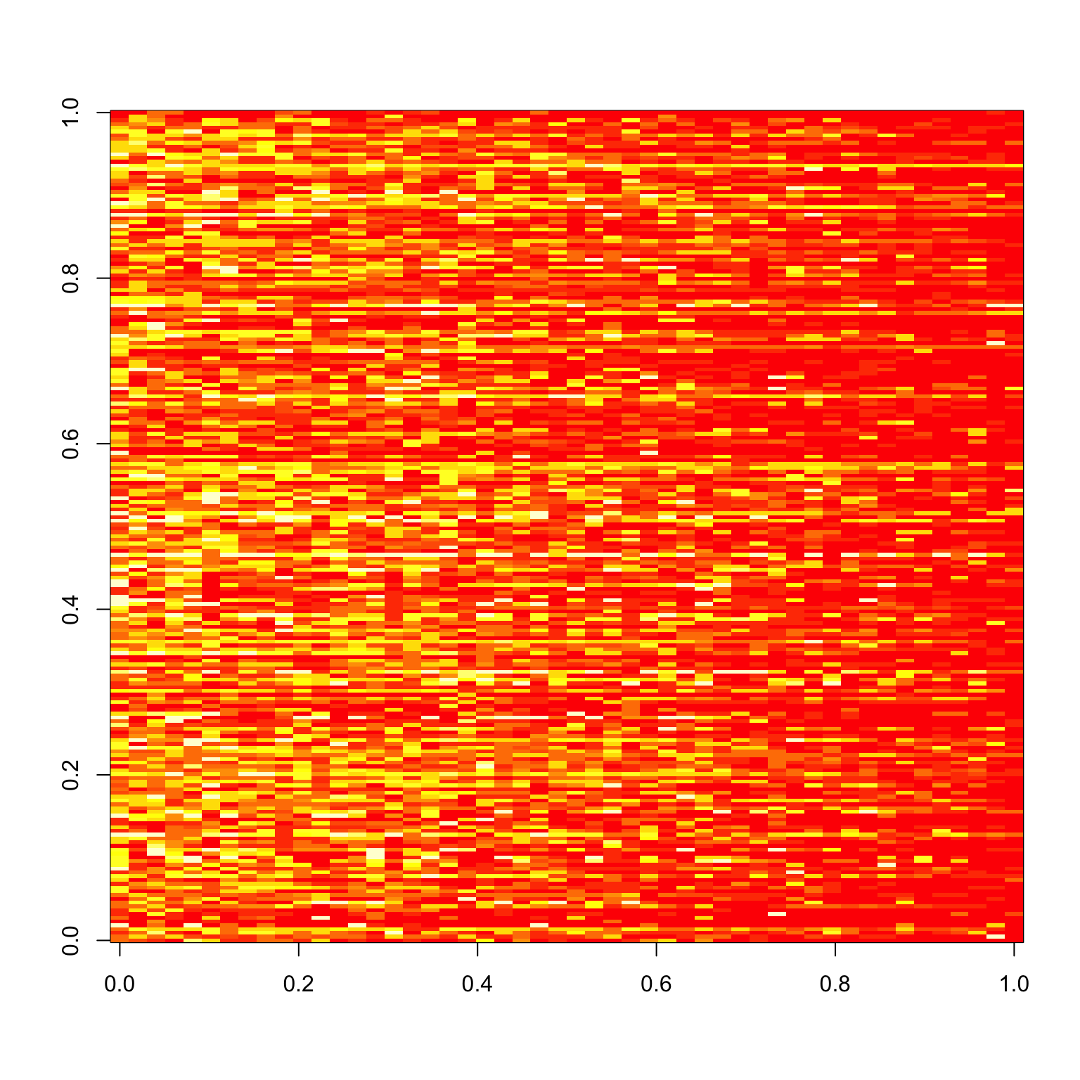
rnd.img <- sample(51:100)
rnd.img1 <- rnd.img[1:25]
rnd.img2 <- rnd.img[26:50]

checkCorrelations(bad.x, rnd.img1, rnd.img2)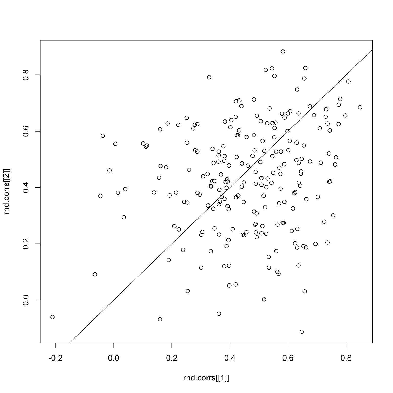
The main problem is that correlations are a very sensitive measure, and since the signals are already pretty weak when we split the images, the sampling makes things even worse.
Alternative Method
Instead of looking at the correlation, why don’t we just look at the Euclidean distance between the mean and the actual response, which would be \[ || \bar{x} - x^{j} || = \left( \sum_{i=1}^{n} (\bar{x}_i - x_i^{j})^2 \right)^{1/2} \] for some subject \(j\).
mean.responses <- tapply(x$response, x$imgRank, mean)
response.table <- tapply(x$response, list(x$imgRank, x$subNo), mean)
dist <- apply(response.table, 2, function(x) sqrt(sum((x - mean.responses)^2)))
par(mfrow=c(1,2))
plot(sort(dist, decreasing=TRUE))
hist(dist)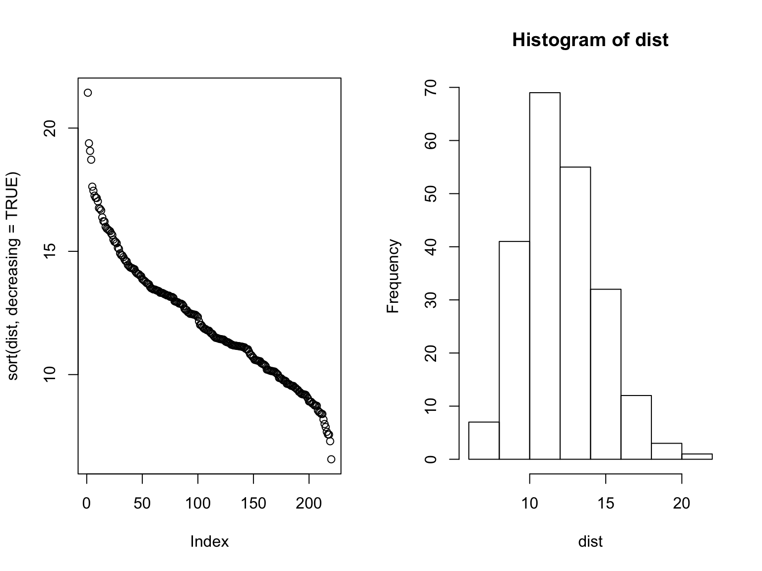
Here, we see a different picture to the correlation story, which is that there’s more of a normal-like distribution. The distance measure is also more successful when performing the robustness check, as demonstrated below.
checkDist <- function(x, rnd.img1, rnd.img2) {
  x1 <- x %>% filter(imgRank %in% rnd.img1)
  x2 <- x %>% filter(imgRank %in% rnd.img2)
  rnd.x <- list(x1, x2)
  rnd.dist <- list()
  for (i in 1:2) {
    rx <- rnd.x[[i]]
    mean.responses <- tapply(rx$response, rx$imgRank, mean)
    response.table <- tapply(rx$response, list(rx$imgRank, rx$subNo), mean)
    dist <- apply(response.table, 2,  function(x) sqrt(sum((x - mean.responses)^2)))
    rnd.dist[[i]] <- dist
  }
  plot(rnd.dist[[1]], rnd.dist[[2]])
  abline(0,1)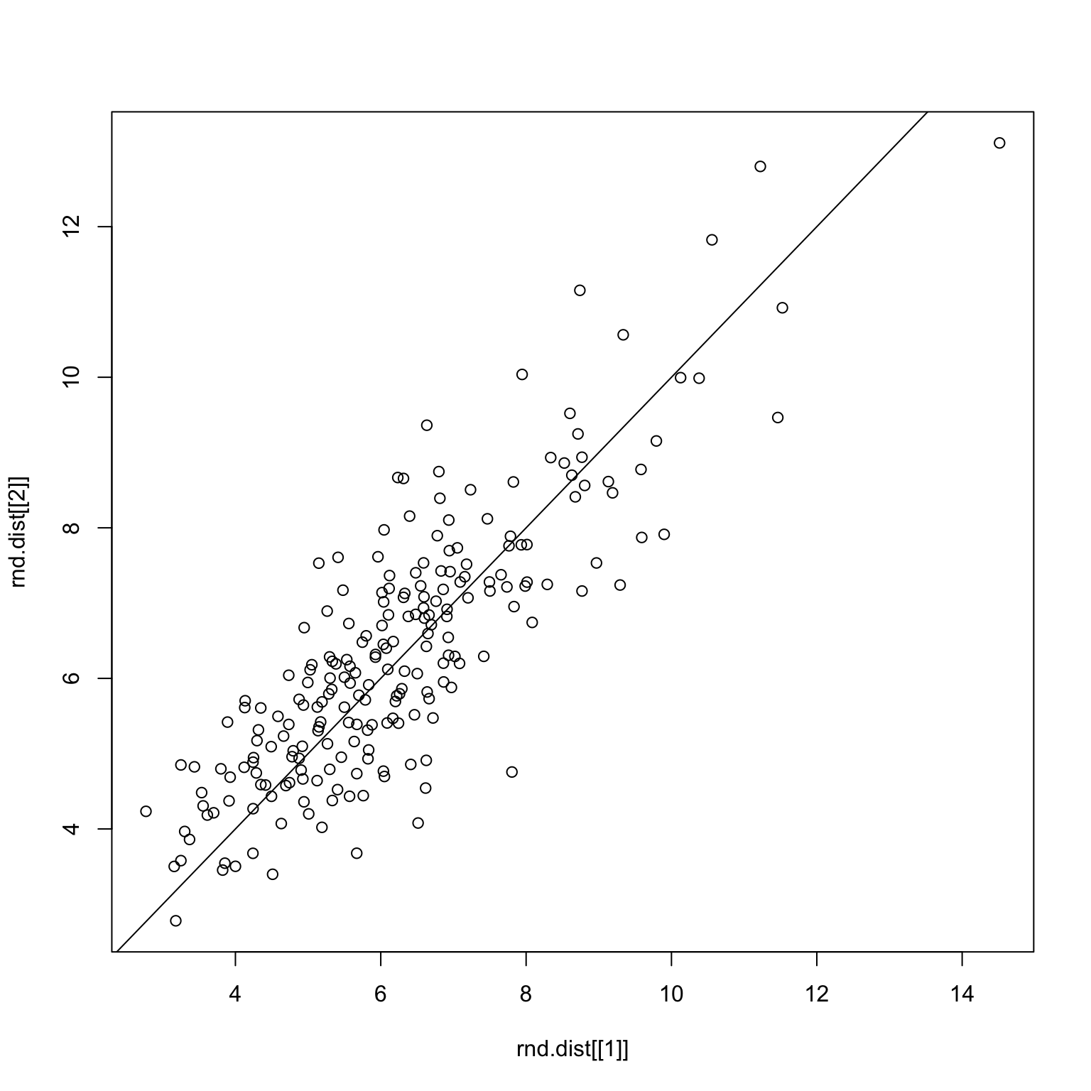
}set.seed(1)
rnd.img <- sample.int(100)
rnd.img1 <- rnd.img[1:50]
rnd.img2 <- rnd.img[51:100]
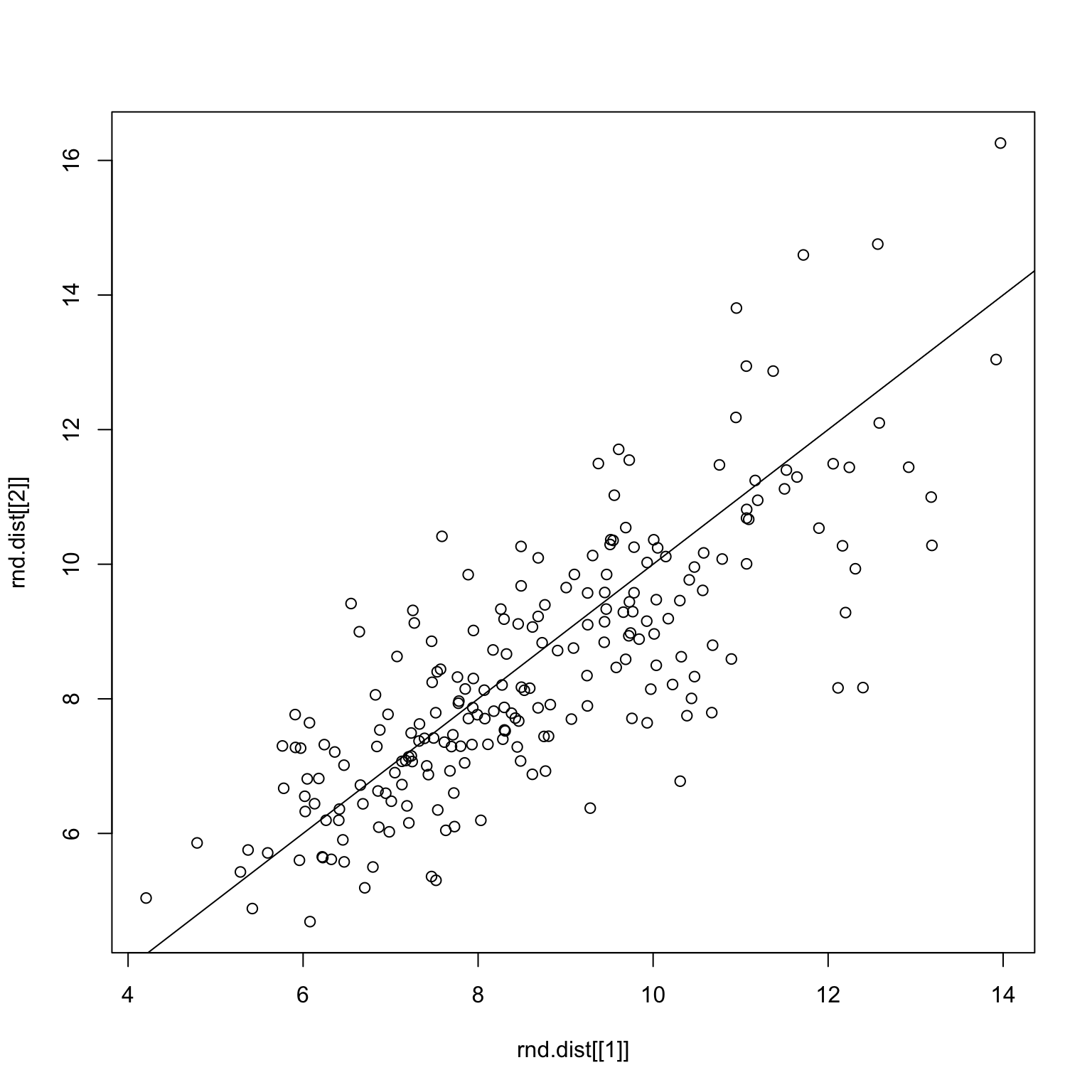
checkDist(x, rnd.img1, rnd.img2)Random split on all images
set.seed(1)
good.x <- x %>% filter(imgGood)
rnd.img <- sample.int(50)
rnd.img1 <- rnd.img[1:25]
rnd.img2 <- rnd.img[26:50]
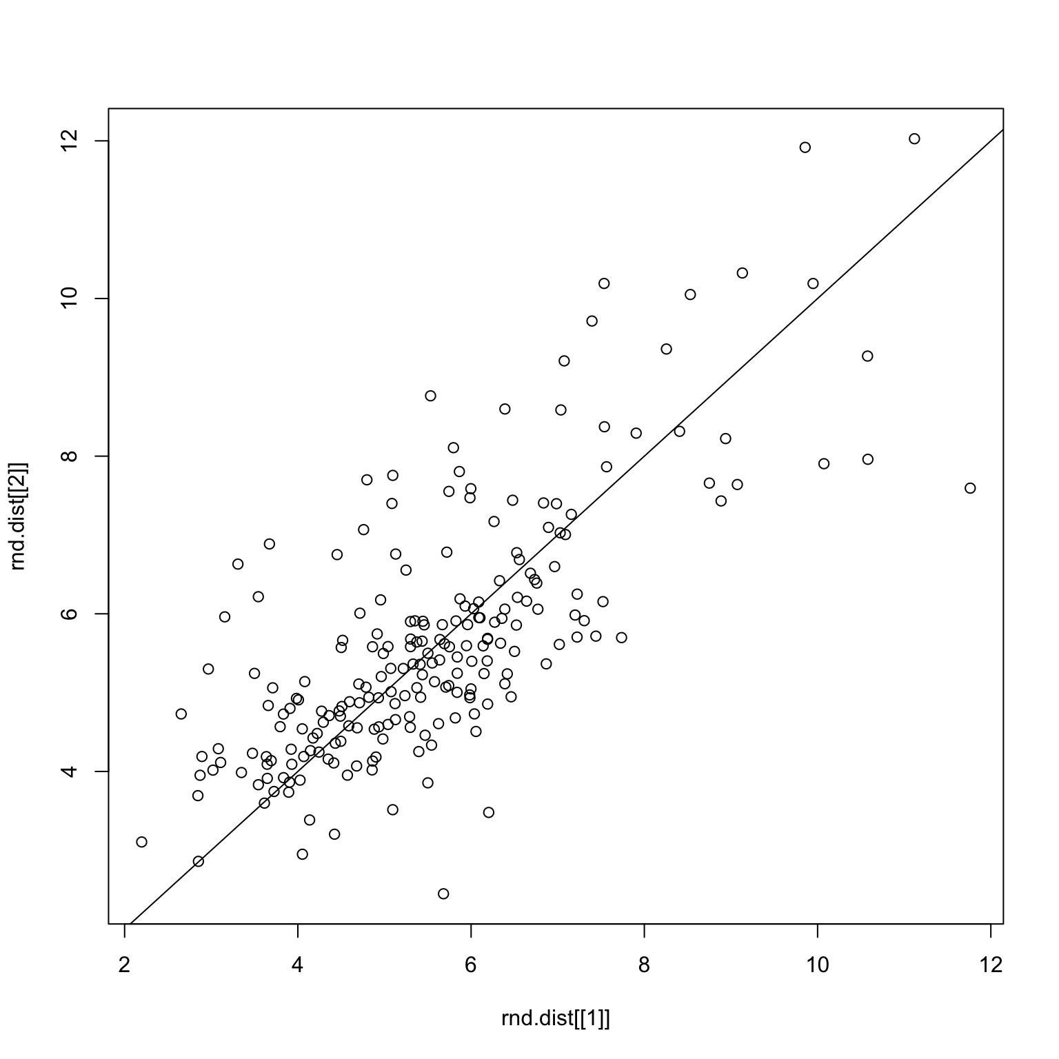
checkDist(good.x, rnd.img1, rnd.img2)Random split on only good images
set.seed(1)
bad.x <- x %>% filter(!imgGood)
rnd.img <- sample(51:100)
rnd.img1 <- rnd.img[1:25]
rnd.img2 <- rnd.img[26:50]
checkDist(bad.x, rnd.img1, rnd.img2)
Random split on only bad images
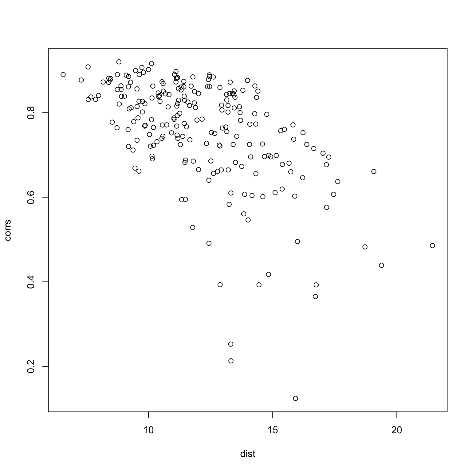
One last thing to do is to check whether or not the two measures produce similar results.
mean.responses <- tapply(x$response, x$imgRank, mean)
response.table <- tapply(x$response, list(x$imgRank, x$subNo), mean)
dist <- apply(response.table, 2, function(x) sqrt(sum((x - mean.responses)^2)))
corrs <- apply(response.table, 2, function(x) cor(x, mean.responses))
plot(dist, corrs)