Area Determination of Property Images
In a class I am taking, we were given the following problem:
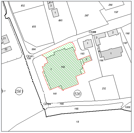
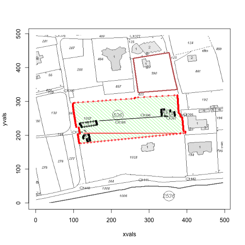
Calculate (rougly) the area of land shaded green, and the area of property in the green land (the grey buildings).
Here is a typical image:
My Attempt
Thankfully, reading .PNG files into R is easy
library(png)
library(geometry)

files <- dir("rawimages", full.names=TRUE)
j <- 2
x <- readPNG(files[j])
dim(x)
## [1] 512 517 3x[1:5,1,]## [,1] [,2] [,3]
## [1,] 0.9725 0.9804 0.9922
## [2,] 0.9725 0.9804 0.9922
## [3,] 0.9725 0.9804 0.9922
## [4,] 0.9725 0.9804 0.9922
## [5,] 0.9725 0.9804 0.9922The output of the readPNG() is a three dimensional array (x-coordinate, y-coordinate, RGB values), which is fairly unwieldy. Thankfully, it is easy to coerce matrices in R.
nrows <- dim(x)[1]
ncols <- dim(x)[2]
total <- nrows * ncols

dim(x) <- c(total, 3)If you’ve played around with matrices, you’ll have noticed that for a 2-dimensional matrix, x[3] will return the element x[3,1].
Thus, the first 5 elements of the new coerced x is equivalent to the above x[1:5,1,] command (the first 5 elements in column 1).
head(x)## [,1] [,2] [,3]
## [1,] 0.9725 0.9804 0.9922
## [2,] 0.9725 0.9804 0.9922
## [3,] 0.9725 0.9804 0.9922
## [4,] 0.9725 0.9804 0.9922
## [5,] 0.9725 0.9804 0.9922
## [6,] 0.9725 0.9804 0.9922To make sure plotting gives the same orientation, we need to flip things around, since graphs start the origin at the bottom left, while the data structure of the PNG will be starting from the top left.
yvals <- rep(nrows:1, ncols)
xvals <- rep(1:ncols, each=nrows)

head(cbind(xvals, yvals))
## xvals yvals
## [1,] 1 512
## [2,] 1 511
## [3,] 1 510
## [4,] 1 509
## [5,] 1 508
## [6,] 1 507Now, we are ready to do some analysis. At first glance, we want to be able to retrieve the red line (or the green area), and the grey area inside that region. It seemed natural to start with k-means clustering, to get a better picture of the different color groups.
km.0 <- kmeans(x, 5, 10)
km.0$centers
## [,1] [,2] [,3]
## 1 0.8980 0.8980 0.8981
## 2 0.0000 0.1789 0.0000
## 3 0.9985 0.9989 0.9996
## 4 1.0000 0.0000 0.0000
## 5 0.8392 0.8392 0.8392these <- km.0$cluster==4Recall that the second column is the green channel (so we would expect the green points to have negligable values in the 1st and 3rd, but high in the second). However, the k-means clustering doesn’t seem to pick them up (weird). We were able to pick up the red and the grey though (red shown below).
plot(xvals, yvals,
    col=apply(x, 1, function(a) rgb(a[1], a[2], a[3])),
    pch=18, cex=0.2)
points(xvals[these], yvals[these], cex=1)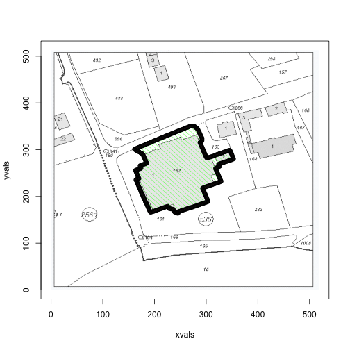
Unfortunately, there are images that have multiple areas denoted by a red border. Since we only care about those shaded green, it is not enough to use the red points. We overstep this problem by restricting our attention to the neighbours of the green area. To get the green values, we shall hazard an educated guess as to the form of the RGB.
green <- x[,2] > 0.9 &
         x[,1] < 0.1 &
         x[,3] < 0.1
Let’s check to see if we’re right
plot(xvals, yvals,
    col=apply(x, 1, function(a) rgb(a[1], a[2], a[3])),
    pch=18, cex=0.2)
points(xvals[green], yvals[green], cex=1)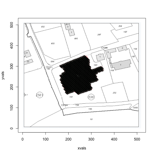
Nice. Okay, so now we can create a rectangle around this area (with some slack, to ensure the red border lies inside the area) that we are interested in.
slack <- 5
xmin <- min(xvals[green])-slack
xmax <- max(xvals[green])+slack
ymin <- min(yvals[green])-slack
ymax <- max(yvals[green])+slack

x[xvals <= xmin | xvals >= xmax | yvals <= ymin | yvals >= ymax,] <- c(1,1,1)
The restricted diagram looks like so:
plot(xvals, yvals,
    col=apply(x, 1, function(a) rgb(a[1], a[2], a[3])),
    pch=18, cex=0.2)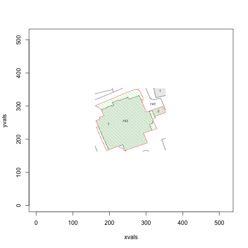
Great! Now we can ignore the green points, and focus our attention on the greys and reds. In the above diagram, we come across another potential problem: there are grey areas in the image that aren’t inside the red boundary. Our algorithm handles that nicely though.
grey <- x[,1] >0.80 & x[,1] < 0.95 &
        x[,2] >0.80 & x[,2] < 0.95 &
        x[,3] >0.80 & x[,3] < 0.95
greys <- which(grey)

red <- x[,1] > 0.95 &
       x[,2] < 0.05 &
       x[,3] < 0.05
reds <- which(red)
The Algorithm
The crux of the algorith is the use of the areapl() function in the splancs library. This function takes a sequence of points that join up to make a polygon, and calculates the area. Importantly, the points must be sequential around the polygon. Hence, the variable red is insufficient. The algorithm is as follows: for each row,
- retrieve the first and last red point
- retrieve the first and last grey point within the red points
min.red <- c()
max.red <- c()
min.grey <- c()
max.grey <- c()
groups <- split(1:total, yvals)
for(i in 1:nrows) {
  row <- groups[[i]]
  row.reds <- row[row %in% reds]
  if (length(row.reds) < 2) next
  min.red <- c(min.red, row.reds[1])
  max.red <- c(max.red, row.reds[length(row.reds)])
  row.greys <- row[row %in% greys]
  # greys must be within the range of red
  row.greys <- row.greys[row.greys > row.reds[1] & row.greys < row.reds[length(row.reds)]]
  if (length(row.greys) < 2) next
  min.grey <- c(min.grey, row.greys[1])
  max.grey <- c(max.grey, row.greys[length(row.greys)])
}

red.pts <- cbind(c(xvals[min.red], rev(xvals[max.red])),
                 c(yvals[min.red], rev(yvals[max.red])))
grey.pts <- cbind(c(xvals[min.grey], rev(xvals[max.grey])),
                  c(yvals[min.grey], rev(yvals[max.grey])))
The polygons we retrieve are shown below.
plot(red.pts, col=1, type='b')
points(grey.pts, col=2, type='b')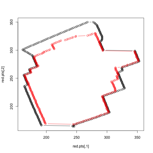
We can now calculate a rough area.
library(splancs)
c(areapl(red.pts), areapl(grey.pts))
## [1] 22306 18594We can now create a function with takes a .PNG file path (and a jump parameter, which determines the number of rows to skip), and returns a plot of the original, the polygons, and the area of the polygons:
area <- function(file, jump=1){
  x <- readPNG(file)

  nrows <- dim(x)[1]
  ncols <- dim(x)[2]
  total <- nrows * ncols

  yvals <- rep(nrows:1, ncols)
  xvals <- rep(1:ncols, each=nrows)
  dim(x) <- c(total, 3)

  plot(xvals, yvals,
       col=apply(x, 1, function(a) rgb(a[1], a[2], a[3])),
       pch=18, cex=0.2)

  green <- x[,2] > 0.9 &
           x[,1] < 0.1 &
           x[,3] < 0.1

  slack <- 5
  xmin <- min(xvals[green])-slack
  xmax <- max(xvals[green])+slack
  ymin <- min(yvals[green])-slack
  ymax <- max(yvals[green])+slack

  x[xvals <= xmin | xvals >= xmax | yvals <= ymin | yvals >= ymax,] <- c(1,1,1)

  grey <- x[,1] >0.80 & x[,1] < 0.95 &
          x[,2] >0.80 & x[,2] < 0.95 &
          x[,3] >0.80 & x[,3] < 0.95
  greys <- which(grey)

  red <- x[,1] > 0.95 &
         x[,2] < 0.05 &
         x[,3] < 0.05
  reds <- which(red)

  min.red <- c()
  max.red <- c()
  min.grey <- c()
  max.grey <- c()
  groups <- split(1:total, yvals)
  n <- floor(nrows/jump)
  for (i in 1:n) {
    row <- groups[[i*jump]]
    row.reds <- row[row %in% reds]
    if (length(row.reds) < 2) next
    min.red <- c(min.red, row.reds[1])
    max.red <- c(max.red, row.reds[length(row.reds)])
    row.greys <- row[row %in% greys]
    # greys must be within the range of red
    row.greys <- row.greys[row.greys > row.reds[1] & row.greys < row.reds[length(row.reds)]]
    if (length(row.greys) < 2) next
    min.grey <- c(min.grey, row.greys[1])
    max.grey <- c(max.grey, row.greys[length(row.greys)])
  }

  red.pts <- cbind(c(xvals[min.red], rev(xvals[max.red])),
                   c(yvals[min.red], rev(yvals[max.red])))
  grey.pts <- cbind(c(xvals[min.grey], rev(xvals[max.grey])),
                    c(yvals[min.grey], rev(yvals[max.grey])))

  points(red.pts, col=2, type='b', cex=0.5)
  points(grey.pts, col=1, type='b', cex=0.5)
  return(c(areapl(red.pts), areapl(grey.pts)))
}
files <- dir("rawimages", full.names=TRUE)
for (i in c(1,3,4)) {
print(area(files[i]))
}
## [1] 32394 1438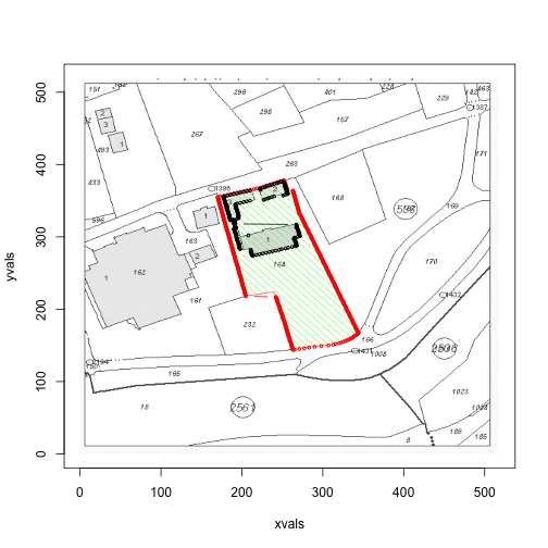
## [1] 20930 4111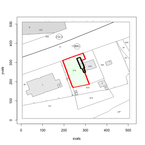
## [1] 13334 1140A Little Extra
If you take a look at the first image, in the above loop, we see that there is anomaly in the red border. Upon further inspection, it turns out that there are times when there will be no red points on the left border, but two red points on the right border (the algorithm ignores situations when there is only one red in a row).
One possible solution is to increase the jump:
area(files[1], jump=5)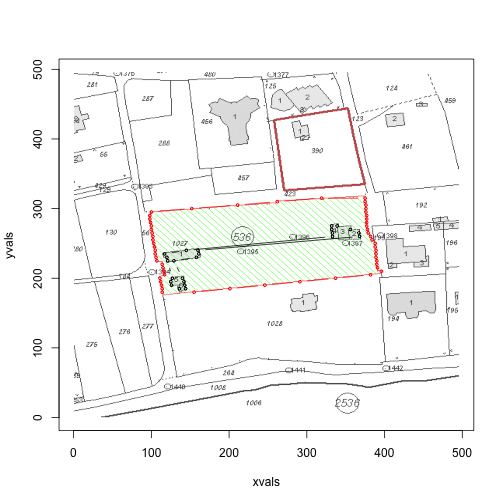
## [1] 32412 1848Alternatively, we can iterate through the min.red and max.red values, and see if there are any anomalies. But this is equivalent to putting more significant figures on an already crude estimate - we’ll leave it here for today.